Data-Viz-Portfolio-Cardinal
| Back to Home Page | Visualizing Debt | Critique by Design | Final Project I | Final Project II | Final Project III |
Assignment 3 & 4: Critique By Design
Critiquing the Original Design
From Neil Paine and Josh Hermsmeyer’s February 1, 2023 FiveThirtyEight article Which Stars Are Going To Blow Up In Super Bowl LVII?
As a devoted Philadelphia Eagles fan, I have a vested interest in this year’s Super Bowl. And as an aspiring data scientist fascinated with the intersection of data and sports, I have a have a vested interested in the cutting-edge sports analytics from FiveThirtyEight as well. In their article, Neil Paine and Josh Hernsmeyer deep dive into the star players from both the Eagles and their Big Game opponent in the Kansas City Chiefs and accomplish such through a mixed-methods of text and data visualizations. FiveThirtyEight often anticipates its readers to have some knowledge of the topic, statistics, and dataviz and this is the case in the aformentioned work from the two sport writers.
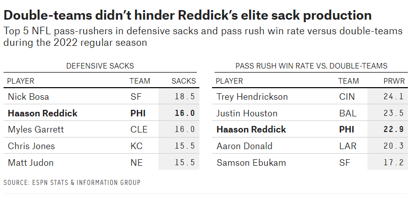
The specific graphic focuses on the elite production of Haason Reddick and how his defensive totals compare to the NFL’s best at getting after the quarterback. The Eagles premier pass-rusher is the sole player in both the top five players in defensive sacks and top five in pass rush win rate versus double-team blocking schemes (e.g. a more advanced metric to evaluate how strong, fast, and elusive a defensive player is). This data is displayed in a compact table with strategic white space, gray shading to underscore the data, proper column labels, an informative title, and bold typeface to highlight Reddick’s production. Despite the informative nature of the table, the comparative element of the data and visualization aesthetics are lacking. It is difficult to compare Reddick against his contemporaries as defensive stats for both sacks and win rate are not included for all the players, excluding Reddick. Further, comparison in such a static, numerical format devoid of color is not intuitive in the data viz’s current table formation.
Wireframing a Redesign Solution
Based on the lacking comparative and aesthetic elements, I decided to add defensive sacks (x-axis) and pass rush win rate versus double-teams (y-axis) data for all nine NFL players included and display them in an interactive scatterplot emphasizing Reddick’s data positioning with strategic use of color (green in this case for the Eagles). The title and subtitle were kept in the wireframe as they are narrative-driven. For the purposes of the wireframe sketch, the scale of the axes were kept at the default provided via Infogram.
Testing the Wireframe
Before publishing the wireframe as full-fledged redesign, I wanted to conduct feedback from a diverse group: a 24 year-old non-sports fan student, a 34 year-old football fan, and three of my non-sporting student peers from the data viz course. To standardize the interviews, I asked three essential seed questions: 1) Can you describe what the graphic is telling you?; 2) Is there anything you found surprising or confusing?; and 3) Is there anything you would change or do differently?
With sports information being presented, the 24 year-old female student froze upon seeing the wireframe. After a second to process the information, however, she reported understanding that dots further right and more vertically centered represented better results. She did not notice that the dataviz was interactive and could not tell what the data points represented until further prompting. Upon final review, her suggestion was to differentiate the color of Reddick’s dot more than that of the gray dots of the remaining players.
Similarly, the 34 year-old male Eagles fan did not find the visualization intuitive on first glance. He too did not know the interactive feature revealed a wireframe panel showing player name and stats in the respective pass rush categories. Once understanding the feature, he understood the magnitude of the data with his sports knowledge and was surprised to find Reddick besting the likes of edge rushing stars Nick Bosa and Myles Garrett in overall efficiency. Equipped with football fandom and some expertise, he did not have any suggestions on improving the graphic.
The trio of students in my class shared many of the same observations. They balked at the sports information being presented, yet applauded the graying and subsequent bolding technique to emphasize Reddick’s datapoint, axes orientation, and the informative titles in the wireframe. To better display the data, the group suggested adding more descriptive elements explaining the defensive data categories, information about the team each player plays for, and possibly color coding the players into each respective top-five list they reside.
Building the Solution
Above lies the final redesign solution made via Flourish. Per the feedback from the interviews, I made the color of Haason Reddick’s dot a brighter kelly green indicative of the Eagles and bold enough to differentiate itself from the gray dots of the remaining players. On that same note, I did not decide to change the color of the other pass rushers to differentiate them into defensive sack and double-team win rate leaders as I found this may distract from the Reddick narrative. To mitigate the interactive hiccups, I added data labels beside the points to clearly show the dots encompass players and not NFL teams. Also, a pop-up panel with players teams in addition to their 2022 regular season stats being considered are included for further exploration of the data. In an attempt to not clutter up the story via explanation of football, I emphasized that double-team win rate is measured in a percentage within the y-axis label. With the orientation of the scatterplot unianomously understandable in the testing phase, the chart type and orientation remained the same from wireframe to final redesign. Ultimately, the redesign successfully provides a more lively and interactive interpretation of Neil Paine and Josh Hermsmeyer’s original table visualization.